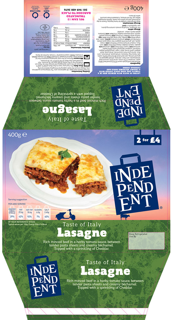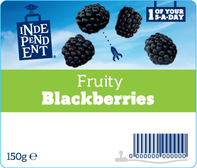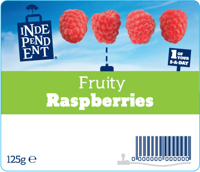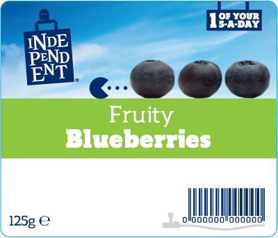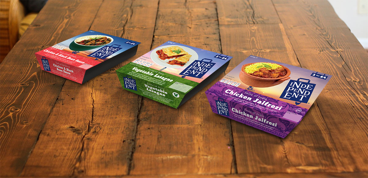
FMCG packaging design and artwork for a new range of value products for independent small stores. Product shots were combined with quirky icons to create a bit of fun for an otherwise mundane range of products.
The design look and feel was done by another agency but had to be applied across a wide range of food and non-food product ranges. A fairly value brand so a stream of new concepts and ideas needed to be created with care but minimum fuss and on a tight budget.
This was when I worked at Martin Dawe, Slough.
